Case study
A one-stop app for farmers who'd never used one
Bringing a digital-first product to an analog-first audience
Syngenta, a company known for seed and fertilizer, had built Cropwise Grower into something much bigger than either: weather-based advice, seed and fertilizer recommendations, a disease-detection camera scanner, an e-commerce shop, geofencing to calculate farm area and input needs, and a community feed. After proving the app in India, Syngenta was rolling it out further across Asia, with Indonesia, Thailand, and Pakistan next in line.
A product head and a couple of product managers from Syngenta brought the research to Lollypop Design Studio, the agency I was working with at the time, ahead of that launch. I led the study with a junior researcher supporting on notes, over roughly three to four weeks.
Designing a test you can run through someone else's voice
None of the growers we tested with spoke English, and I don't speak Bahasa, Thai, or Urdu. Every session ran through a translator: regional Syngenta contacts who already knew the farmers and spoke English, but weren't professional research translators. That gap is exactly what most usability studies don't plan for, so a lot of the real design work on this project happened before a single participant touched a screen.
We recruited 17 growers across three countries, spanning young, middle-aged, and elderly growers.
| Country | Growers |
|---|---|
| Indonesia | 6 |
| Thailand | 5 |
| Pakistan | 6 |
| Age range | Growers |
|---|---|
| 25-34 | 4 |
| 35-44 | 8 |
| 45-54 | 6 |
Recruitment skewed heavily male (15 of 17), a limitation we called out directly in the report rather than glossing over.
Even the physical setup took real sketching to get right: one device in the farmer's hands running the prototype, with visible-touch enabled so we could see exactly where they tapped; a second device (ideally a laptop, though we ended up using a second phone) positioned with its camera on the farmer and its mic capturing both the translator and the farmer, so nothing said in either language was lost.
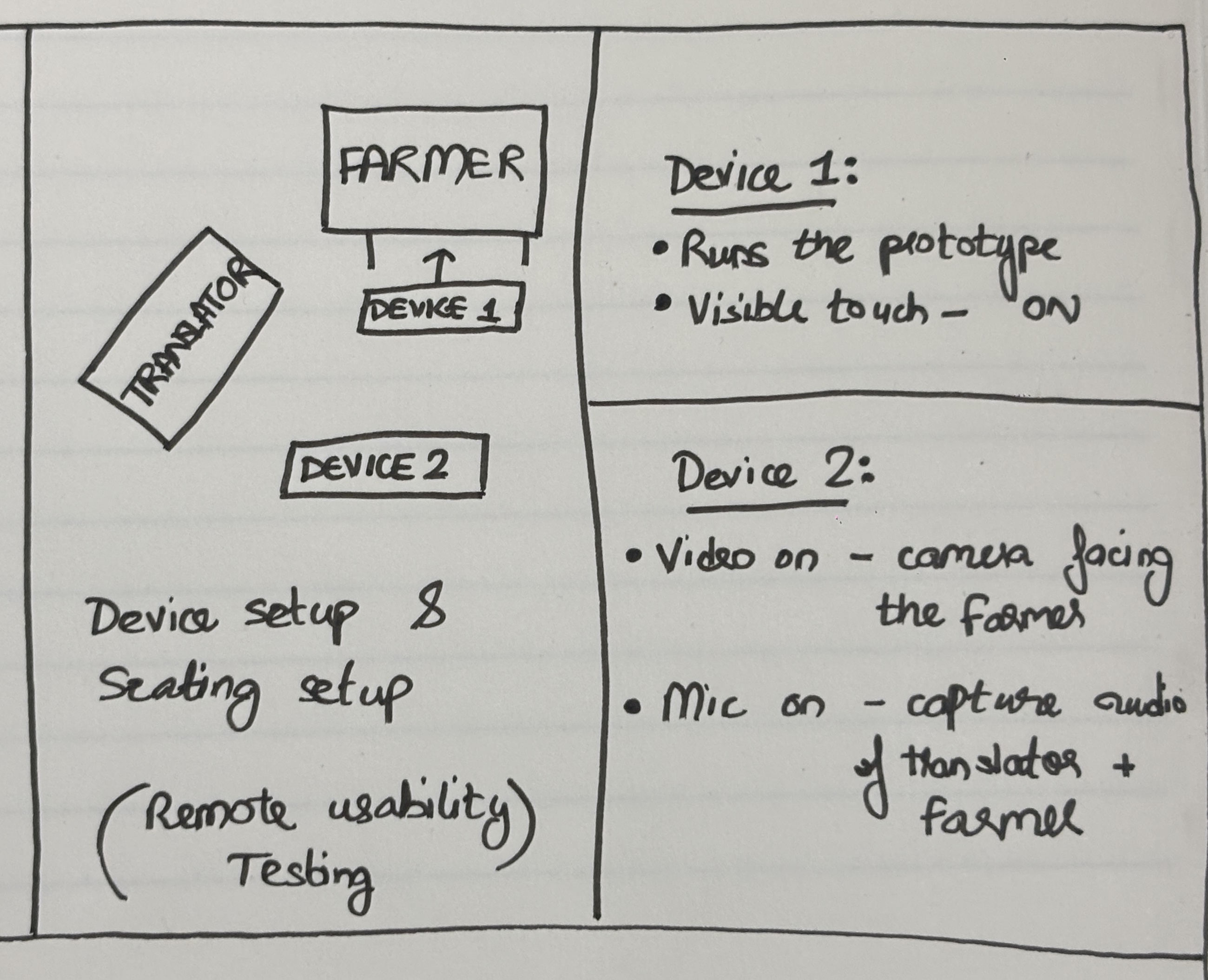
The device and seating setup sketched out and shared with translators ahead of each session.
Sessions covered onboarding plus ten feature areas: dashboard, weather, nearby retailers, the shop, crop tracking, pest scanning, seed and product scanning, crop protection, community, and loyalty.
The translator workshop
Handing someone a discussion guide and asking them to translate in real time isn't the same as briefing a research moderator: treating it that way is how a study quietly loses its data without anyone noticing. Before any session, I ran a workshop with the translators covering:
- Neutrality: translate as close to verbatim as possible; don't summarize or interpret on the farmer's behalf
- Trial runs: practicing translation on sample questions before we were ever in front of a real participant
- A few borrowed phrases: I learned "pause here," "hi, how are you," and "thank you" in each local language myself, partly for accuracy, mostly to build a little rapport directly with participants rather than working entirely through an intermediary
Translators weren't responsible for note-taking (that stayed with the junior researcher), which let them focus fully on the participant instead of splitting attention.
Because we only had one or two translators per language, each one ran multiple sessions, and something useful happened as a result: they got faster and more attuned over time. A "pause here" got relayed instantly instead of a beat late. A couple of translators started asking their own follow-up "why" without being prompted. Quality didn't stay flat across the study: it visibly compounded.
What broke, and what that taught us
Two things derailed sessions outright: blinding midday sun that made screens unreadable even at full brightness, and sudden rain that meant relocating mid-session. Neither was a research failure: the sun issue became a finding.
If your primary users are outdoors, screen visibility in direct sunlight isn't an edge case, it's core to the design brief.
The rest of what surfaced was more about cultural fit than usability mechanics. The market icon in the design looked like a Western farmers'-market stall, and growers didn't recognize it. Seed examples referenced fruit that simply doesn't grow where these farmers farm. None of this would have been obvious sitting in an office in London: it only shows up when you test with the actual people the product is for, in the actual conditions they use it in.
It's worth stating the limits of this research plainly, as the report itself did. Translation inevitably lost some nuance: a two-word answer would sometimes come back as a seven-word translation. The prototype itself shaped behavior it shouldn't have: an autofill feature made parts of onboarding faster than the real app would ever be. Connectivity also dropped mid-session more than once. None of this invalidates the findings, but a study run through a language barrier, on a prototype, and on a compressed timeline warrants transparency about its edges rather than an unqualified success narrative.
Where things stand
What I found informed the designs, and the designs that shipped were almost identical to the research-informed versions. The larger experience stayed consistent with what the research shaped.
The contextualisation insight became key to the app's expansion. Apps across locations now showcase markets, photos and crops based on local context. The agency was also invited back to run the same kind of study for farmers in Vietnam.
Context, not a claim: public reporting puts Cropwise Grower at roughly 497,000 registered users across India, Pakistan, Indonesia, Bangladesh, Thailand, and Malaysia as of August 2023, with adoption accelerating quickly in the months before. That's Syngenta's reach rather than a result of this study, but it's the scale that the research-informed experience now serves.
Inside the app
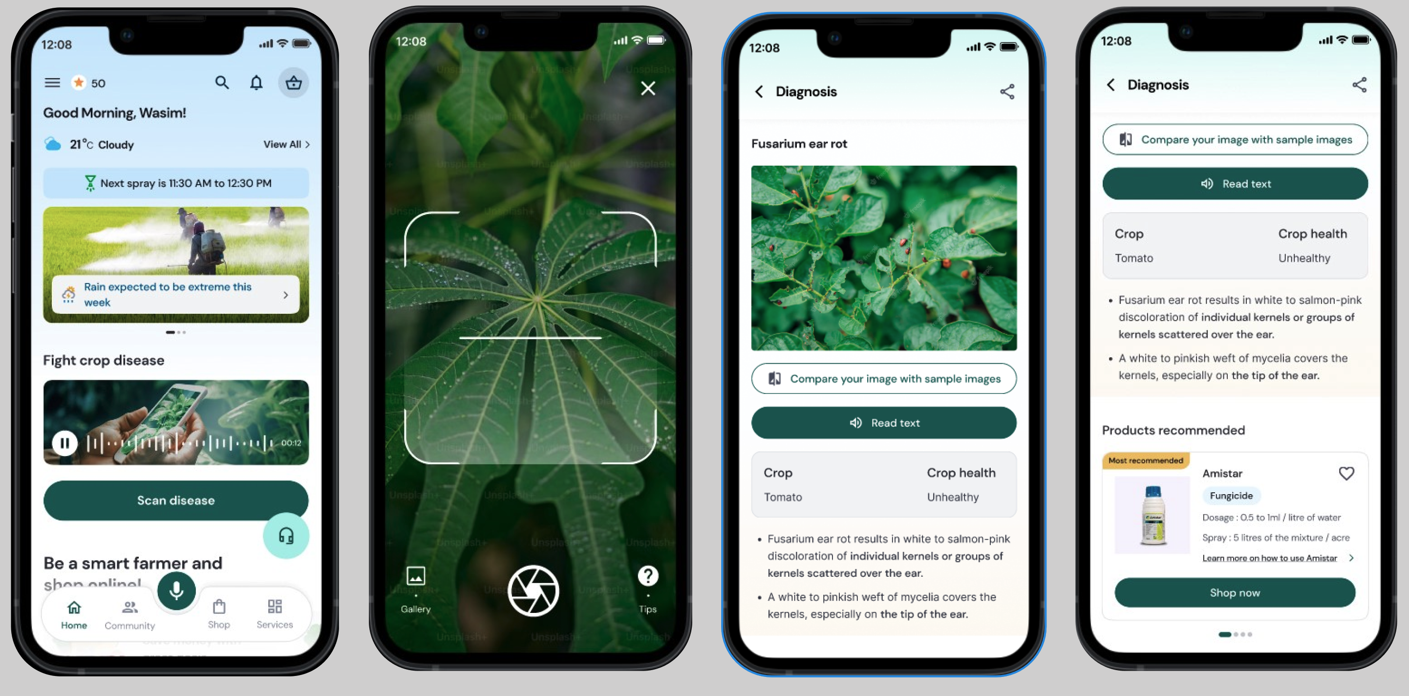
Scan, diagnose, shop: the flow growers used most. From the home screen, growers could jump straight into the disease scanner, get a diagnosis with treatment guidance, and move directly from that diagnosis to a recommended product.
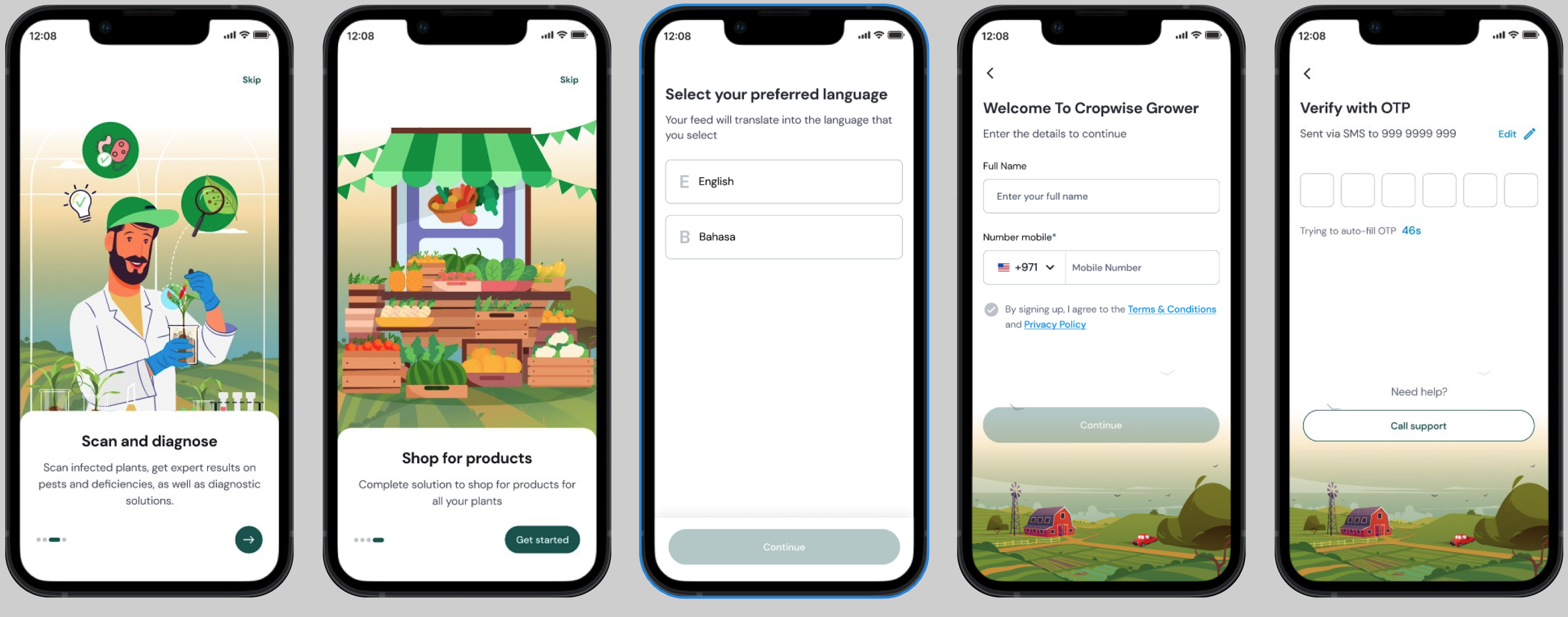
Onboarding, built for a first smartphone experience. Language selection up front, illustrated walkthroughs of the core value props, and a simple OTP-based sign-up rather than anything requiring a password to remember.
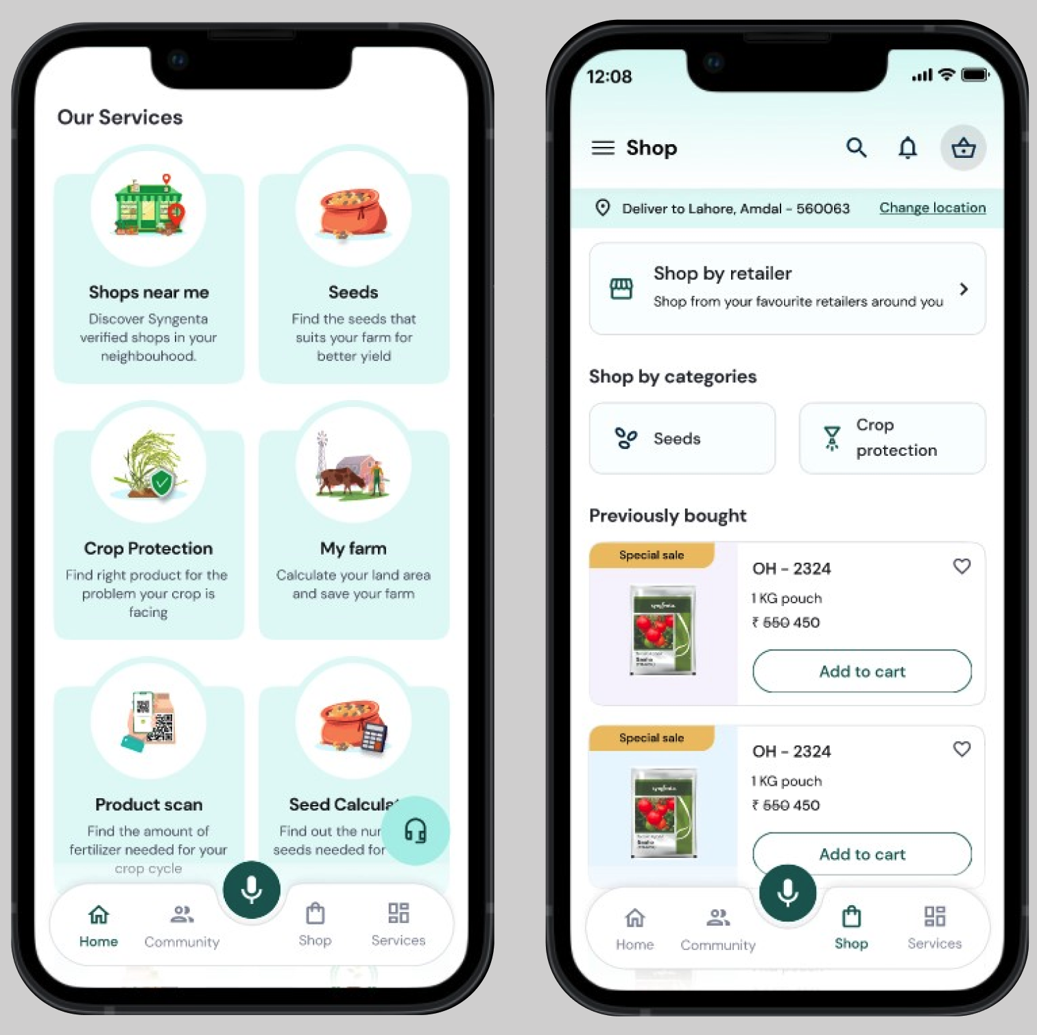
Beyond diagnosis: the services and shop growers could reach. Nearby retailers, crop protection guidance, farm-area calculation, and a shop for reordering seed and product.
What I carry into every study since
Before this project, I mostly evaluated designs through my own reactions: if something confused me, I'd wonder if it would confuse a user too. Cropwise broke that habit for good.
I watched things that wouldn't have raised my eyebrow at all completely stop someone who has farmed that land for twenty years:
It taught me to treat a user's physical environment, community, and existing ways of getting advice as part of the design problem, not background noise around it.
That's a lens I now bring to every study, not just the ones with an obvious language gap.